This case study is private. Please do not share beyond the intended audience.
2026 / Chance (Series A Consumer Startup)
Optimizing a deposit flow for conversions
I redesigned one of the biggest drop-off points in our purchase funnel, built the frontend directly on our existing product, and worked with engineering to ship it in 2 days.
the brief
7 clicks and 7 seconds. H O R R E N D O U S
That was basically the brief.
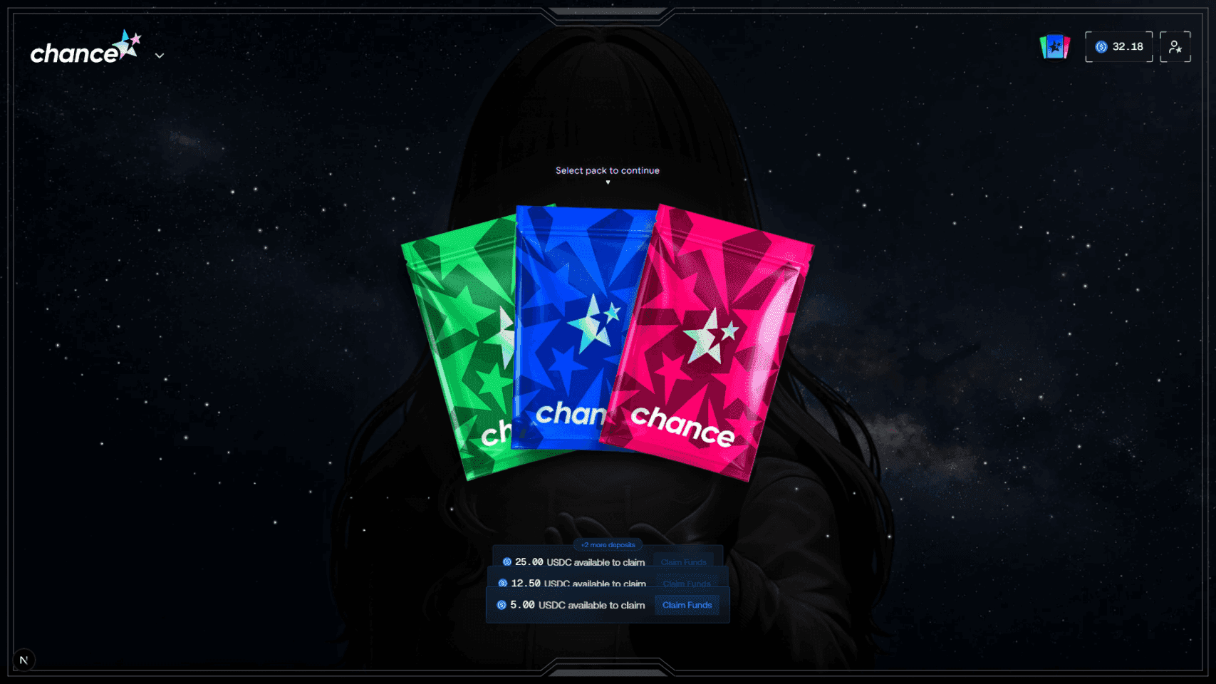
People come to Chance to open Pokémon packs. If they did not have enough money in their balance, we made them leave what they were doing, deposit USDC, wait for it, redeem it, then come back and buy the pack. I started by running the whole thing myself with test funds and taking notes.

ux audit
7 clicks was kind of generous
A lot of users saw the green success state, assumed they were finished, and closed the modal without redeeming. The fix at the time was a toast reminding them to come back and redeem their funds. That was one of those moments where the product was telling us what was wrong.
The same modal also contained USDC deposit history. I did not think transaction history belonged inside the thing you use to add money, so I started redesigning the History page to hold it instead. Different rabbit hole.
system
Follow the money
Before changing the interface, I needed to know why it worked this way. I talked to the developers and mapped the transaction from clicking Buy to actually seeing spendable USDC in someone’s Chance balance.
I learned how CoinFlow, our balance, the crypto transaction, and redemption actually worked together. The redeem step existed for a technical reason. Users still did not need to understand any of that. Most of the people I talked to were not crypto-native. They were trying to buy Pokémon cards.
How might we make crypto disappear without touching the backend?


constraint
Keep the backend. Fix everything around it
I wanted this live as fast as possible. CoinFlow worked, and our transaction infrastructure worked. I was not going to turn a funnel problem into a backend rebuild. The widget updates when the amount changes, so some interactions that looked fine in Figma felt terrible once I ran them. I explored a few structures while preserving the existing transaction.
design exploration
One modal, a lot of ways in
The balance modal does a lot. The experience changes depending on how you got there: Balance, Add Funds, Buy USDC with card, Deposit USDC directly, or Withdraw.
I mapped these separately before settling on the interaction. I optimized the card flow first because 98% of our users deposit with a card, while keeping every other path intact.
solution
The new card flow
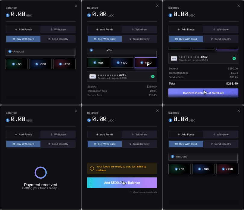
Click your balance. No hover. No Manage Funds screen. Add Funds is already open. Buy with Card is already selected.
7 clicks · old flow
3 clicks · new flow
decision
One click I wanted to keep
One proposal was to open the full deposit modal immediately when someone tried to buy a pack without enough money. I thought that felt rude. Looking at a pack does not mean you are ready for a giant payment modal in your face. We tested it with members of the team. They hated having the payment modal open in their face. We kept the lightweight Top Off screen. That extra click earned its place. The flow shipped at 3 clicks.


prototype
I built it while I designed it
A lot of the questions I cared about were behavioral. Static screens were not very useful for that.
• What happens when the amount changes?
• When does CoinFlow open?
• What does the handoff after payment feel like?
• How long are you waiting for the USDC?
• What does the balance do while it updates?
So I vibe coded the frontend directly on our existing product using Claude, connected it to test funds, and ran transactions while I was designing it. Once the frontend felt right, I worked with our developer to connect it to the existing backend.

validation
Then we watched the funnel
People were entering the funnel more often. Attempted deposits went from 7.44% to 13.81%. In the week after launch, order volume was 1.8× higher.
It is early. The post-launch conversion window is only three days, and order volume can move for plenty of reasons. I am continuing to watch it. So far, more people are trying to deposit, more of them are finishing, and more orders are going through.
7.44% → 13.81% attempted deposits
+81% signup-to-deposit conversion

takeaways
Follow the money to make money
I learned to get close to the system before trying to simplify the interface. Once I understood how the money actually moved, it became obvious what users never needed to know.
More clicks can be good?
I got more comfortable keeping a click when it earned its place. The 3-click flow gave people context before asking them to pay.
Wow, vibe-coding is fun
Building it myself changed the pace. I could test the real behavior, design around CoinFlow instead of guessing, and get the whole thing out in two days.